Pillbox Charts App
Overall Description
The Pillbox Charts Shiny App shows you every offensive or defensive snap of every game. It shows every player that was on the field for the snap, what down it was, and whether it was a pass or run play. It also shows you the outcome of every drive in the game.
Offensive and Defensive Pillboxes
The Pillbox Charts are very dense graphics from an information point of view. This graphic has a list of every player who played a snap in a given game as the Y axis (vertical axis), and a tick (or pill, thus pillbox chart) for every snap that player played in that game.
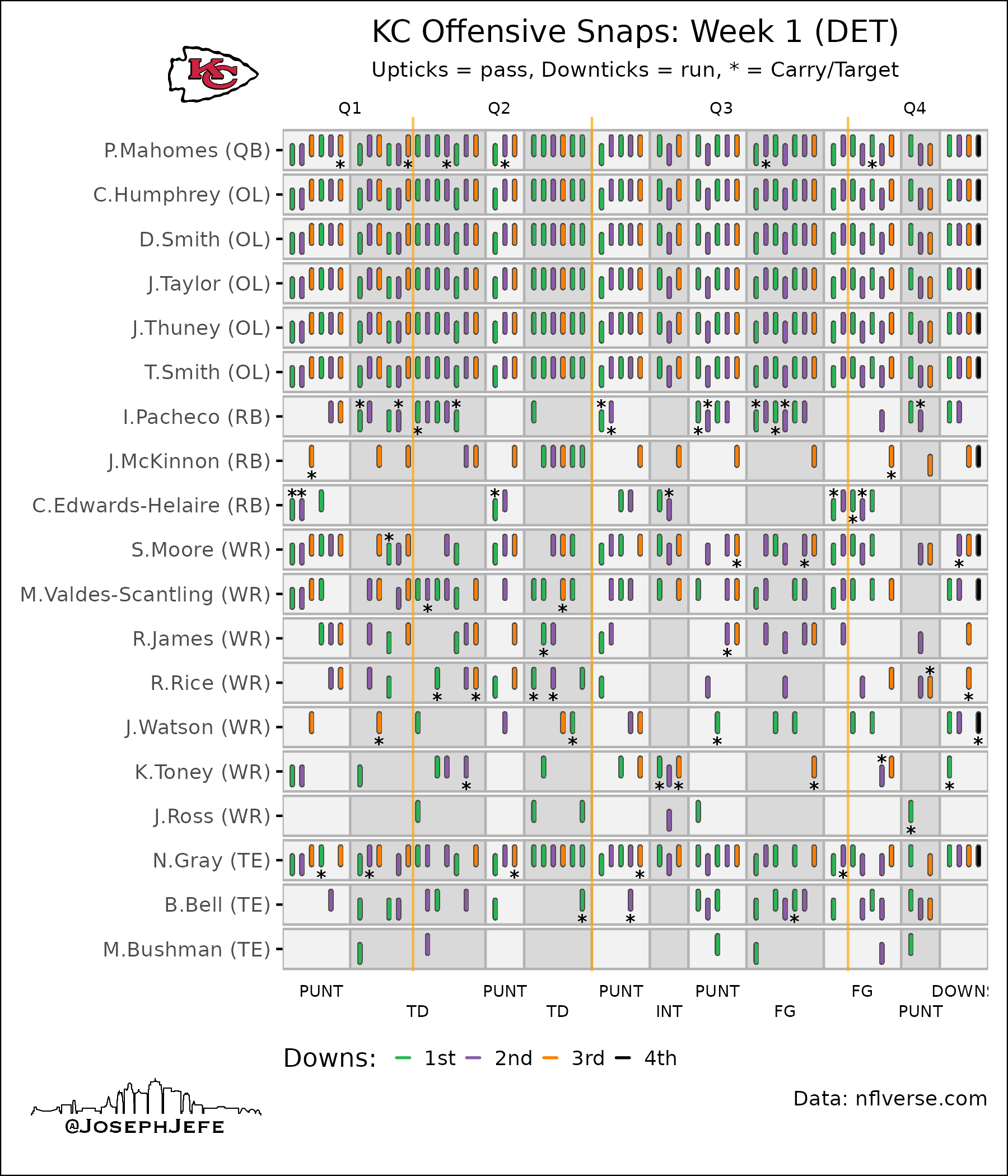
Looking at this graphic, you can pretty immediately see that Patrick Mahomes and the entire offensive line were on the field for every snap. That’s not exactly news to anyone, but this allows you to see it really easily. Across the very top of the graphic, you can see that there are labels and vertical orange lines showing where each quarter started.
You can also notice that the background color of the graphic changes from white to gray columns. Each column represents a separate drive. Across the bottom of the graphic, you can see what the drive outcome was (punt, TD, interception, etc.).
Next up, you can see that the ticks are offset a bit from each other. If they are offset upwards, they are pass plays. Downward offsets are pass plays. This is nice because you can easily see which drives featured a lot of rushing, and which ones were more passing-heavy. For example, the last drive in the second quarter was entirely passing. No runs at all. In fact, we only ran the ball twice in the entire second quarter!
The last things to notice are the colors of the ticks, and the asterisks. The colors indicate the down (1st, 2nd, etc.), and the asterisk indicates which player either got the handoff or was targeted with a pass. You can see that Mahomes has some asterisks, all on pass plays. Those are his scrambles. If he kept it as a designed QB run, it would be a downtick with the asterisk. Note that each position group is sorted by most snaps to least snaps.
Now that we’ve gone through how to read the graphic, let’s actually see if it can tell us anything. Looking at McKinnon, we see that he was in on only one total run play. Every other play was a pass play. His row is also almost entirely orange, indicating that he was mostly in for 3rd downs. Pacheco, on the other hand, only has one orange tick. Edwards-Helaire has none. McKinnon is clearly the 3rd down back.
Looking at WRs, we can see that Skyy Moore and Marquez Valdez-Scantling had the most WR snaps. Rashee Rice had a bunch of work in the first half, but in the third quarter he only saw three total snaps, all run plays. The second quarter was especially nice to him, seeing 4 targets and one touchdown reception. Justin Watson was only in on pass plays.
The defensive version of this graphic follows all the same rules, except it doesn’t have the asterisks for targets and carries.
You can easily change the season, team, and week from the left hand sidebar. Just make your changes to the selections and then hit “Submit” to see those changes. You can also use the download buttons for offense and defense to download a .png image of the graphic.